Front-end/React
[nivo chart] HeatMap chart 리액트 니보 차트 라이브러리 사용법
꼬바리
2022. 7. 4. 13:58
니보 공식사이트는 추가설명이 너무 불친절 해서 사용하기 어려웠다.
초반 어떤걸 다운 받고 어떤걸 임포트 해야하는지 정보제공이 매우 불친절..
그럴꺼면 왜 공식사이트를 만든건지
개인적으로 평소 차트 라이브러리는 chart js 를 가장많이 사용한다.
chart js는 아쉽게도 HeatMap 차트가 없다.
Home | nivo
nivo.rocks
🍖완성 화면

🍕Install
// npm install @nivo/core // 기본적으로 설치
// npm install @nivo/heatmap
🍔import
import { ResponsiveHeatMap } from '@nivo/heatmap'
차트 라이브러리 는 대부분 2가지만 신경쓰면된다
data / option
- 데이터를 뿌려주는 형식
- 차트를 보여주는 옵션 설정
🍟 HTML 코드
option설정을 한다.
차트를 감싸는 div에 style을 지정해주지않으면 출력되지 않는다.
 {/* 차트 */}
<div style={{ width: 'auto', height: '400px', margin: '0 auto' }}>
    <ResponsiveHeatMap
        data={data} //chart에 사용될 데이터
        tooltip={CustomTooltip}
        margin={{ top: 10, right: 80, bottom: 100, left: 50 }}
        valueFormat={dataFormat}  //그래프 데이터 형식
        xOuterPadding={0.1}
        enableGridX={true}
        axisTop={null}
        axisBottom={{   //시간대 라벨 x축
            tickSize: 5,
            tickPadding: 5,
            tickRotation: -45,
            legend: 'TIME',
            legendPosition: 'middle',
            legendOffset: 80,   // 레전드타이틀 높이 조절 + 일수록 아래로
        }}
        axisLeft={{     //이벤트 라벨 y축
            tickSize: 5,
            tickPadding: 5,
            tickRotation: 0,
            legend: '',
            legendPosition: 'middle',
            legendOffset: -60
        }}
        colors={{      //그래프 색상
            type: 'diverging',
            scheme: 'reds',  //reds , oranges
            divergeAt: 0.5,   //분기점?? 최소값과 최대값 사이의 분기점 (0~1) +일수록 전체적인 색 연해짐
            minValue: 0,
            maxValue: 10,       //max value - 백분률 임으로, 100이 맞으나 , 정확한 색 표현을 위해 10으로 출력
        }}
        emptyColor="#ffffff"
        borderColor={{
            from: 'color',
            modifiers: [
                [
                    'darker',
                    0.8
                ]
            ]
        }}
        label={
            function(e){
                let data = e.value
                if(data == 0){
                    return "-"
                }else{
                    return e.value + "%"
                }
            }
        }  //라벨 출력 형식 + %
        labelTextColor={{   //라벨 출력 색상
            from: 'color',
            modifiers: [
                [
                    'darker',
                    2
                ]
            ]
        }}
        legends={[      //오른쪽 x축 range 레전드
            {
                anchor: 'right',
                min : 0,
                max : 10,   //max value - 백분률 임으로, 100이 맞으나 , 정확한 색 표현을 위해 10으로 출력
                translateX: 40,
                translateY: 0,
                length: 300,
                thickness: 15,
                direction: 'column',    //레전드 방향 행/열
                tickPosition: 'after',
                tickSize: 10,
                tickSpacing: 3,
                tickOverlap: false,   //막대에 라인
                tickFormat:{dataFormat}, //레전드 형식
                title: '%',
                titleAlign: 'start',
                titleOffset: 5,
            }
        ]}
        annotations={[]}    //주석,메모 형식의 포인트 가능
    />
const dataFormat = ' > ,.2~d'
top bottom left right 에 출력되는 라벨
tootip (마우스 오버시, 출력되는 정보)
legend (라벨 표시)
옵션에 없지만 주석도 표현할수있다.
🌭DATA 형식
    //data 형식
    const data = [
    {
        "id": "쓰러짐",
        "data": [
        {
            "x":"00:00",
            "y": 70563
        },
        {
            "x": "01:00",
            "y": -85825
        },
        {
            "x": "02:00",
            "y": 41750
        }
        ]
    },
    ]
데이터는 이런형식으로 랜더링시 세팅
tooltip은 라이브러리 가 가지고있는 기존 툴팁을 사용해도되지만
custom 가능하다
공식사이트, 구글에 정보가 너무 없어서
tooltip만들려고 이것저것 npm install했지만
결론은 아무것도 인스톨 하지않아도 충분히 커스텀 해서 사용 가능
//툴팁 커스텀
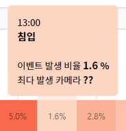
const CustomTooltip = (point) => {
console.log(point.cell)
let cell =point.cell
let styleValue = {
width: 'auto',
maxHeight:'250px',
color: `${cell.value > 4.9 ? '#ffffff' : '#000000'}`, //중간 값 49가 defalut max 값변경시, 변경 해줘야함
marginBottom: '20px',
padding: '10px',
border:`2px solid ${cell.color}`,
borderRadius : '5px',
backgroundColor: cell.color,
}
var fontSize = {fontSize : '12px'}
return (
<div style={styleValue}>
<span style={fontSize}>{cell.data.x}</span>
<br />
<strong>{cell.serieId}</strong>
<br />
<br />
<span style={fontSize}>이벤트 발생 비율 </span> <strong> {cell.value} <span style={fontSize}> % </span></strong>
<br />
<span style={fontSize}>최다 발생 카메라 </span> <strong> ?? </strong>
</div>
)
}옵션에
tooltip={CustomTooltip}
연결해 주었다.
color: `${cell.value > 4.9 ? '#ffffff' : '#000000'}`,
설정 해주어 색이 연하면 검정글씨, 찐하면 흰글씨로 정보의 가시성을 높였다.

처음엔 정보가 부족하여 사용 하기 어려웠지만
충분히 쉽고 간단한 차트라이브러리
728x90
반응형