저는 실제 데이터를 받아와서 출력했습니다. (아래 코드는 임의 데이터 넣은것)
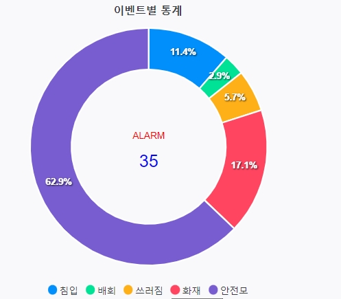
퍼센테이지로 출력되며
hover시, 데이터라벨명과 값이 tooltip으로 출력됩니다.
도넛 가운데 total 카운트 도 출력되는 예제입니다.
리액트 그래프 라이브러리중 간결하며 사용하기 좋은 라이브러리 입니다.
라이브러리 사용하여, 도넛 그래프 출력
😎npm install / import
import ReactApexChart from "react-apexcharts";
//npm install react-apexcharts apexcharts
😎script 코드
//도넛 차트 데이터 및 옵션
  const donutData = {
      series: [50,40,30,10,0],
      options: {
        chart: {
          type: 'donut',
        },
        legend: {
          position: 'bottom'
        },
        responsive: [{
          breakpoint: 480,
        }],
        plotOptions: {
          pie: {
            donut: {
              // hollow: {
              //   margin: 15,
              //   size: '70%',
              //   image: '../../css/images/a-icon.jpg',
              //   imageWidth: 64,
              //   imageHeight: 64,
              //   imageClipped: false
              // },
              labels: {
                show: true,
                total: {
                  showAlways: true,
                  show: true,
                  label: 'ALARM',
                  fontSize: '12px',
                  color: 'red'
                },
                value: {
                  fontSize: '22px',
                  show: true,
                  color: 'blue',
                },
              },
            }
          }
        },
        labels: ["침입", "배회", "쓰러짐", "화재", "안전모"],
        title: {
          text: '이벤트별 통계',
          align: 'center'
        },
      },
    }
주석 처리된 코드는 가운데 total 카운트를 출력하는 공간에 이미지를 넣으려 했는데 실패했습니다^^
😎HTML 코드
<div>
    <div id="chart">
        <ReactApexChart
            options={donutData.options}
            series={donutData.series}
            type="donut"
            width="500"
        />
    </div>
</div>
사이트에 옵션 변경등 자세히 나와있으며,
이렇게만 넣어도 도넛 그래프 출력 가능합니다.
ApexCharts.js - Open Source JavaScript Charts for your website
ApexCharts is a a free and open-source modern charting library that helps developers to create beautiful and interactive visualizations for web pages.
apexcharts.com
728x90
반응형
'Front-end > React' 카테고리의 다른 글
| [Chart JS] 도넛 그래프 굵기 변경 _ "react-chartjs-2" (0) | 2022.04.22 |
|---|---|
| [Chart.js] options 설정 - bar 두께 조절 및 다양한 옵션 (0) | 2022.04.21 |
| [React] 스페이스바 안먹히는 오류 - 개인적 기록 (0) | 2022.04.01 |
| [React] history.push()로 props 데이터 넘겨주기 (0) | 2022.03.03 |
| create-react-app 명령어 입력시 에러 해결법 : 'create-react-app'은(는) 내부 또는 외부 명령, 실행할 수 있는 프로그램, 또는배치 파일이 아닙니다. (0) | 2022.01.13 |

댓글